
Customizing Your Portal’s Font and Colors
Portal Appearance lets you match your client portals to your brand beyond your logo and primary color. Choose a font, set your text, background, and sidebar colors, and check a live preview before your clients see anything.
Each setting has a default that matches how portals look today, so nothing changes until you change it.
📢 Note: Only team members with the Admin role can access Team Settings. See Managing Team Members.
How to Customize Your Portal’s Appearance
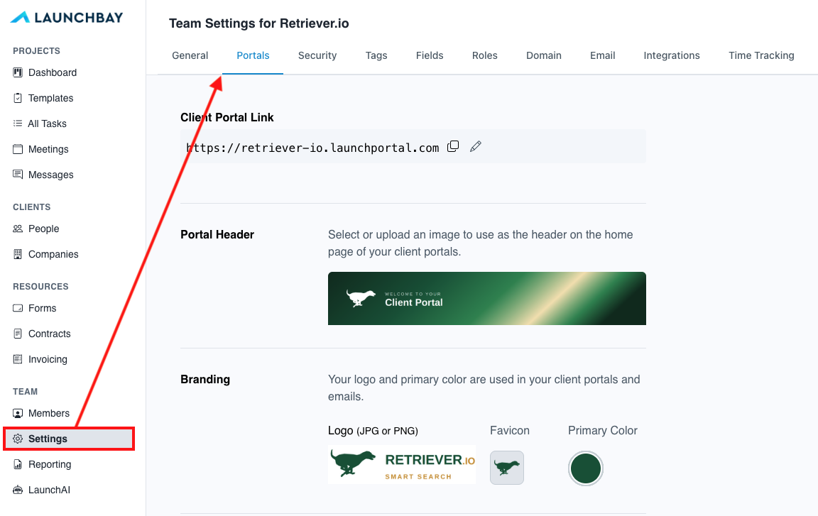
- Go to Settings and open the Portals tab.
- Scroll to Portal Appearance.
- Choose a font, then set your font color, page background, and sidebar & top bar color. Adjust the sidebar font color and selected menu item color too if you’d like. Click Reset next to any color to return to the default.
- Check the live preview below the settings. If you see a contrast warning, adjust the color it names.
- Click Save Changes.

Your changes appear in every client portal right away, on desktop and mobile, and carry through to the portal login page.
What Each Setting Changes
| Setting | What it changes | Default |
|---|---|---|
| Font | Every heading, menu item, and line of text in the portal | Inter |
| Font color | Headings and main text | Near-black |
| Page background | The area behind your projects, tasks, and files | Light gray |
| Sidebar & top bar | The navigation menu and the breadcrumb bar (the top bar on mobile) | White |
| Sidebar font color | Menu text and icons in the sidebar and top bar | Your font color |
| Selected menu item | The highlight behind the page your client is on | Your primary color |
Choosing a Font
You can choose from 13 fonts. Each one fits the portal’s existing spacing, so long project names and task lists won’t wrap awkwardly or overflow. The font menu shows every option in its own typeface, so you can compare them at a glance.

- Sans-serif: Inter, Roboto, Open Sans, Lato, Source Sans 3, IBM Plex Sans, DM Sans, Plus Jakarta Sans, and Figtree
- Serif: Lora, Source Serif 4, PT Serif, and Noto Serif
Keeping Colors Readable
LaunchBay checks every color combination before you save it. Your font color has to stand out against white cards, your page background, and your sidebar, using the WCAG AA standard (a 4.5:1 contrast ratio). If a combination falls short, a warning names the color to change, and the setting won’t save until it’s readable. That means you can try different combinations without risking a portal your clients have to squint at.

Previewing Your Changes
As you change a setting, the preview updates to show a sample home page with your logo, sidebar menu, a project card, a task list, and a button. It uses your real primary color, so you can see how highlights, progress bars, and buttons look against your new font and backgrounds.

👋 Want a dark sidebar?
Set a sidebar font color, and the sidebar and top bar can be as dark as your brand. You can pick your own color for the selected menu item too, and its text switches to white or dark automatically so it stays readable.